A blank wall above a sofa is one of the most reliably unresolved problems in living rooms. Something goes up — a single print, a cluster of mismatched frames — and it still reads as off, without any obvious reason why. The issue is almost never the art itself. It’s height, proportion, and the visual connection between the wall and the furniture below.
Gallery wall ideas above a sofa work when three things align: the bottom frame sits 6–8 inches above the sofa back, the total arrangement spans 75–85% of the sofa’s width, and something consistent — a frame finish, a mat color, an art style — threads through every piece. Get those right and a grouping of nine or thirteen frames can look calmer than a single canvas hung in the wrong spot. This guide covers 13 layouts, exact sizing by sofa width, a planning framework you can use tonight, and the one placement mistake that shows up in almost every living room I walk into. It’s in the final section.
Key takeaways:
- Hang the bottom frame 6–8 inches above the sofa back — not based on floor-to-center measurement
- The visual center of the full arrangement should land near 57 inches from the floor
- Gallery wall width should span 75–85% of the sofa’s length
- Odd-numbered groupings — 7, 9, 11, 13 — look more natural than even ones in most formats
- Keep 2–3 inches between frames; consistent spacing matters more than matching sizes
What makes a gallery wall above a sofa actually work
A gallery wall above a sofa works when it reads as one intentional unit rather than a collection of individual frames. The arrangement needs to feel wide enough to belong to the sofa, tall enough to fill the space without crowding the ceiling, and internally coherent enough that the eye moves through it rather than bouncing between pieces.
Treating the sofa as your anchor
Standard sofas run 60–96 inches wide. A gallery wall above one should span 75–85% of that length. Over a 72-inch sofa, aim for 54–60 inches across. Narrower than 65% and the arrangement looks like an afterthought. Wider than the sofa and the art floats away from the furniture below it.
The living room styling decisions around the sofa — rug dimensions, lamp height, side table placement — shape the visual context the gallery wall sits within. Those elements affect how the wall reads, not just the frames themselves.
Visual weight, not mirror symmetry
Visual weight is how anchoring or heavy a piece feels. A large dark-framed print carries more weight than three small light ones, even if those three smaller frames cover a similar wall area. Balanced weight matters more than perfect symmetry. A 16×20 print on one side can visually balance three 5×7 frames stacked on the other — if the total mass feels even.
Symmetrical grids feel formal and precise. Asymmetrical arrangements feel curated and personal. Let the room’s overall tone decide which to use; neither is inherently wrong.
How high should a gallery wall be above a sofa?
The bottom of your lowest frame should sit 6–8 inches above the sofa back. With a typical sofa back at 36 inches from the floor, that puts your lowest frame at 42–44 inches. Build upward so the visual center of the full arrangement lands near 57 inches — the standard eye-level reference used by professional installers and galleries alike.
Less than 6 inches and the art appears to rest on the sofa. More than 10 inches and the arrangement disconnects from the furniture entirely, reading as generic room decoration rather than something specific to the sofa below. For high-backed sofas (back at 40+ inches), limit the arrangement to two rows maximum. Three rows above a high back crowds the wall and pushes the upper frames uncomfortably close to the ceiling.
13 gallery wall ideas above a sofa
These layouts cover the range from formal and structured to personal and eclectic. Each includes a specific practical detail — a measurement, a material, or a spacing call — because inspiration without specifics is difficult to execute.
1. Classic symmetrical grid
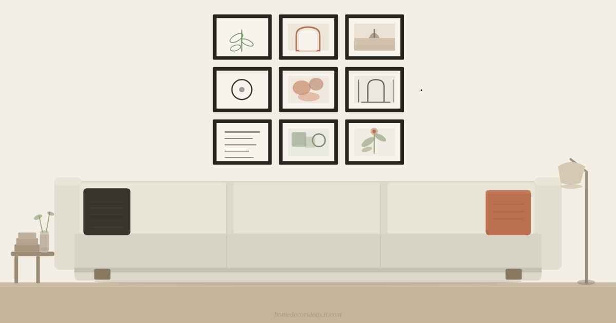
Nine 8×10 frames in a 3×3 arrangement, exactly 2.5 inches apart both horizontally and vertically. The grid reads as deliberate only when spacing is exact; any variation breaks the effect entirely. Matte black or flat white frames handle this format cleanest. Use the same mat width in every frame.
2. Loose salon-style arrangement
Mix 9–13 frames across three or four sizes — two 16×20 anchors surrounded by 8×10 and 5×7 fillers. Lay the full arrangement on the floor first and photograph it before moving to the wall. This is the most forgiving layout: small adjustments after the anchor frames are up are easy to make, and the asymmetry absorbs minor corrections.
3. Black and white photography wall
Portraits, travel landscapes, or architectural shots in black and white, varied sizes, consistent black frames. A unified tonal palette creates cohesion even when subjects differ widely. Don’t mix black-and-white prints with color ones — the two palettes fight rather than complement each other.
4. Mixed media with a mirror
One round or arched mirror (18–24 inches in diameter) positioned near center, with frames built around it. The mirror adds depth and reflects light back into the room. A round shape creates useful contrast against the rectangular frames surrounding it, and it reads well in both modern and more traditional spaces.
5. All-black frames, varied art
Different sizes — 5×7, 8×10, 11×14, 16×20 — in matte black frames. The consistent finish holds varied content together regardless of what’s inside: botanical illustrations, abstract prints, travel photos, or typographic posters. This is the gallery wall format that translates across nearly any interior style from Japandi to traditional.
6. Warm wood frames, botanical prints
Walnut, oak, or light maple frames with botanical illustrations or pressed plant prints. This reads particularly well above a linen or bouclé sofa in warm neutral tones. Varying frame depth slightly — some at 0.75-inch profile, some at 1.5-inch — adds textural interest without sacrificing visual cohesion.
7. Single-palette abstract collection
Five to seven abstract prints in one color story — terracotta, cream, and charcoal work well together — in frames that coordinate without needing to be identical. The shared palette reads as intention even when the individual pieces differ significantly in composition and scale.
8. Vertical stack for narrow walls
Three or four same-width frames (8×10 or 11×14), stacked with 3 inches between each, above a loveseat or two-seater. This format suits apartments and rooms where horizontal wall space is limited. A single vertical column can be more effective than forcing a horizontal spread onto a wall that doesn’t have the width for it.
9. Centerpiece with flanking art
One large print (20×24 or 24×30) at center, with two smaller frames (8×10) flanking it at mid-height. Three hanging points are far simpler to level and align than nine. A good choice when you want the wall to read as intentional but not busy.
10. Single-row horizontal line
Five to seven same-size frames (8×10) in one horizontal row, centered at 57 inches, 2 inches apart. Effective over long sofas (90+ inches) and one of the few formats where an even number of frames reads well.
11. Travel photo wall
Twelve to fifteen 4×6 or 5×7 prints in a mix of portrait and landscape orientations, in thin identical frames with 1.5 inches between each. The density makes the arrangement look deliberate. Identical frames — black or white — prevent the tight spacing from tipping into visual clutter.
12. Vintage illustration mix
Antique botanical plates, old maps, or natural history prints share visual DNA through illustration style and period, regardless of specific subject matter. Gilt frames amplify the vintage character; matte black frames give the same prints a more contemporary reading.
13. Monochrome family photo wall
Convert all photos to black and white to unify images from different eras and lighting conditions. Consistent processing is what separates a considered family wall from a collage. Identical white or natural wood frames keep the focus on the photographs rather than the framing.
Frame sizes, spacing, and layout by sofa width
Scale your frame count and size range to the sofa’s proportions. Buy the anchor sizes first; smaller accent frames fill in around them.
| Sofa width | Target arrangement width | Frame count | Anchor frame sizes |
|---|---|---|---|
| 60–72 in | 50–60 in | 7–9 | 8×10, 11×14 |
| 73–84 in | 60–68 in | 9–11 | 11×14, 16×20 |
| 85–96 in | 70–80 in | 11–13 | 16×20, 20×24 |
| 97–120 in | 78–90 in | 13–15 | 20×24, 24×30 |
Arrangement width = total span from the outer edge of the leftmost frame to the outer edge of the rightmost frame.
Keep 2–3 inches between frames for gallery-style separation. Tighter spacing — 1 to 1.5 inches — gives a dense, collected quality suited to travel photo walls. Beyond 4 inches, individual frames start reading as separate pieces rather than a grouped arrangement.
Pro tip: Before drilling, trace each frame on brown paper, cut the shapes out, and tape the paper templates to the wall. Rearrange them until the layout is exactly right, mark nail positions through the paper, then pull the templates off and hang. A laser level on multi-row arrangements is faster and more accurate than a spirit level.
Frame finish is the second decision after layout. Three strategies hold across most styles:
| Finish strategy | How it works | Best for |
|---|---|---|
| All identical | Every frame in one finish: matte black, white, or natural wood | Minimal or contemporary spaces; easiest to execute |
| Two complementary | Black and wood, or brass and white — one finish covers at least 70% of frames | Transitional and eclectic styles |
| Mixed finishes, uniform mats | Frame finishes vary; identical cream or white mats inside each frame | Collected or maximalist arrangements |
For detail on wood versus metal versus composite frame materials at different price points, the frame styles guide covers the practical differences clearly.
The Three-Anchor Method: a framework for any gallery wall
The Three-Anchor Method is a planning approach that prevents the most common gallery wall failure: a layout that looks balanced on the floor but drifts or crowds once it goes on the wall.
Before hanging anything, identify three anchor frames — your largest or most visually dominant piece, plus two medium-sized ones. Hang these three first: the large piece at or near center, the two mediums flanking it on either side at different heights. These three establish the visual weight distribution for the entire arrangement. Every remaining frame fills in around the skeleton they create.
Once the three anchors are level, you can see whether the arrangement will balance before committing to more nail holes. The American Society of Interior Designers identifies visual balance as a foundational principle in interior composition, and the Three-Anchor Method is a direct application of it — before a single filler frame goes up.
Mini case study: I arranged the same 11 frames in my own 14-foot living room twice before, and both attempts felt wrong — too crowded on one side, too sparse on the other. Applying the Three-Anchor Method on a Saturday afternoon — a 16×20 center piece first, then two 11×14 frames flanking it at slightly different heights — gave me a skeleton that looked balanced before I’d touched the remaining eight frames. All 11 prints and frames came in under $130. That arrangement has been up unchanged for over two years.
How to arrange a gallery wall above your sofa: step by step
- Measure the sofa width and multiply by 0.80. That’s your target arrangement span.
- Pick your three anchor frames: largest piece plus two medium ones.
- Lay all frames on the floor and photograph the arrangement before moving to the wall.
- Cut paper templates and tape them to the wall. Hang from center outward.
- Mark nail positions through the paper templates, remove them, then hang the anchors.
- Level every row before starting the next, and leave 6–8 inches above the sofa back for the lowest frame.
Mistakes that make gallery walls look wrong
Hanging everything too high
The single most common error. Most people position art at standing eye level in the room, not relative to the sofa. A frame centered at 70–72 inches from the floor looks disconnected from a sofa whose back sits at 36 inches. And if you’ve rearranged your arrangement more than once and it still feels off without knowing why, this is almost certainly what’s happening.
Fix: Measure 6–8 inches up from the sofa back. That marks the bottom edge of your lowest frame. Work upward from there.
Using all the same frame size
A wall of identical-size frames reads as a repetitive pattern rather than a curated arrangement. This is also where the concern about clutter comes from — “won’t a lot of frames make a small room look chaotic?” — but cluttered gallery walls almost always result from mixed finishes or inconsistent sizes, not from the total frame count. Size variation paired with a consistent frame finish creates the visual hierarchy that reads as intention.
Fix: Choose one dominant size for most frames, add one or two larger anchor pieces, and include a few smaller accents. Three tiers — large, medium, small — is all the variety you need.
Starting from a nail instead of a plan
Hanging the first frame and building outward from it almost always produces an arrangement that crowds one side, runs out of wall space, or drifts off-center. There’s no clean way to fix it without starting over.
Fix: Paper templates on the wall before any nails go in. Rearrange until the layout is right, mark positions through the paper, remove, and hang. For hardware suited to drywall, plaster, and brick, the picture hanging guide covers each wall type in detail.
FAQs
How many frames should a gallery wall above a sofa have? Seven to thirteen is the practical range for most sofas. Fewer than seven can read as sparse unless the individual pieces are large. More than thirteen is difficult to keep cohesive without careful planning. Odd numbers — 7, 9, 11, 13 — tend to look more natural than even-numbered groupings in asymmetrical formats, though a single-row horizontal line is one exception where even works well.
Can a gallery wall work above a sectional sofa? Yes. Anchor the arrangement to the primary seating section — the longest continuous run of seats — rather than trying to span the full L-shape. A very wide arrangement covering an entire sectional typically looks imposed rather than intentional. Focus the wall where most of the sitting happens.
What art works best in a gallery wall above a sofa? Pieces in a consistent color story: neutral tones, a single accent color running through several prints, or unified subject matter. The individual pieces don’t need to match, but something should connect them — palette, subject, artistic style, or era. A single thread is all the cohesion requires.
Do all frames in a gallery wall need to match? No. But something must be consistent — frame finish, mat color, or art style. An arrangement where every element varies across every frame typically reads as chaotic rather than curated. Pick one thing to hold steady and let the rest vary.
Putting it together
Gallery wall ideas above a sofa come down to three fundamentals: start 6–8 inches above the sofa back, span 75–85% of the sofa’s width, and pick one element to unify every frame. The Three-Anchor Method handles layout planning before nails go in; paper templates handle placement before drilling. Neither step takes more than 30 minutes, and both prevent most of the rearranging.
Pick one of the 13 layouts above, pull your frames onto the floor first, and photograph the arrangement before anything goes on the wall. That single habit changes results more than any other part of the process. For more on pulling a living room together from floor to ceiling, the HomeDecorIdeas interior design section covers the layered decisions — lighting scale, furniture proportion, rug sizing — that affect how any gallery wall reads in context.
Get inspired by thought-provoking articles—find our front-page highlights full of fresh wisdom.