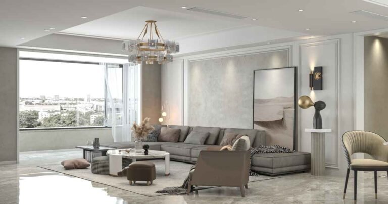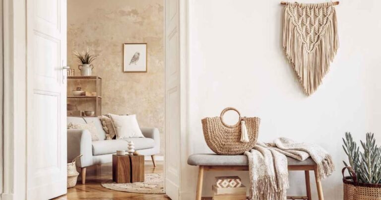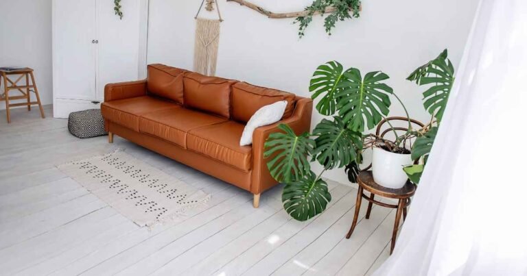
Small apartments punish bad design decisions faster than any other space. A sofa that’s six inches too wide, or a rug that stops short of the furniture legs, can make a 500-square-foot flat feel like a storage unit. Modern minimalist small apartment design solves this not by stripping everything out, but by making deliberate choices about what earns its place.
This guide covers 11 strategies (furniture scale, lighting temperature, rug sizing, and more) that work in studios, one-bedrooms, and compact urban flats. Most changes cost under $150. The mistake in the last section is the one I see in almost every apartment, and it takes less than an afternoon to fix.
Key takeaways:
- Keep walkways at 30–36 inches minimum to preserve the feeling of openness
- Furniture flush against the walls makes a room feel smaller; pull pieces 3–5 inches away
- Warm bulbs at 2700K make neutral walls feel intentional rather than bare
- One statement piece per zone reads as design; two reads as clutter
- Floor-to-ceiling storage draws the eye upward and adds perceived height
- An undersized rug is the single most common small-space decorating mistake
What modern minimalist small apartment design actually means
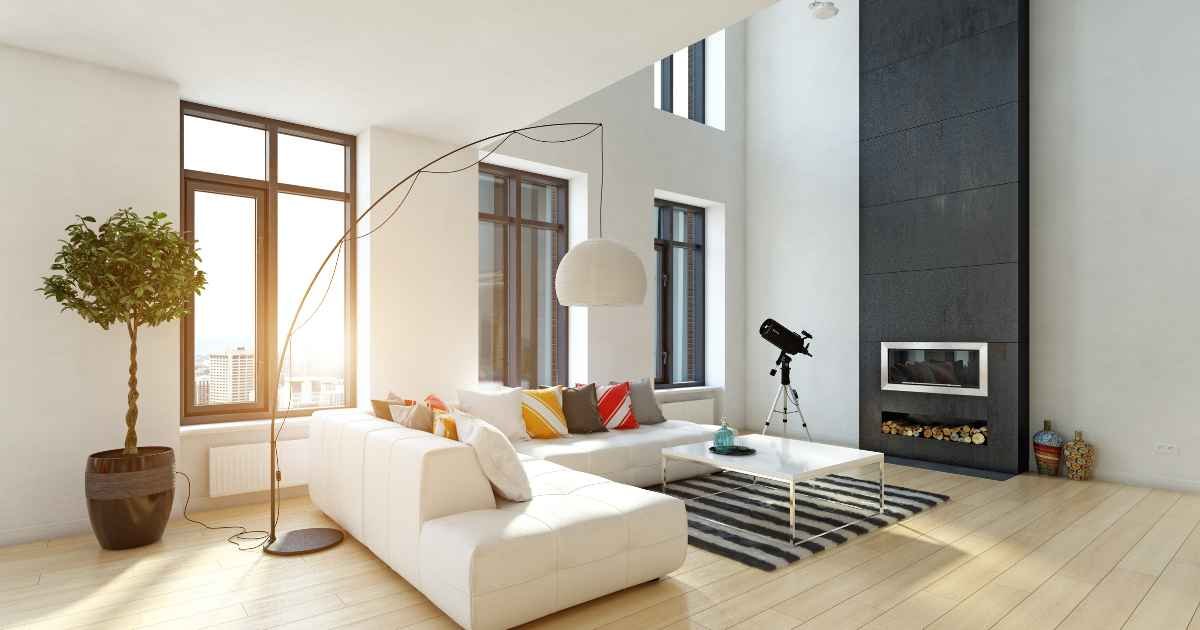
Modern minimalist design for small apartments is a specific approach to spatial editing: choosing fewer objects with higher visual clarity, setting consistent sightlines from the entrance, and using furniture that does more than one job. It differs from sparse or unfinished aesthetics. A well-executed minimalist apartment feels calm and considered, not empty.
The style draws from Scandinavian and Japanese interior traditions but adapts to contemporary urban living. Neutral palettes, materials like rattan and linen, and a strict limit on decorative clutter define it. You don’t need to own less; you need to display less, and to make what you do display feel intentional.
The four core principles
- Edited objects: Each surface holds a maximum of three items
- Unified palette: No more than three tones across walls, furniture, and textiles
- Functional furniture: Every piece earns its floor space by serving at least two purposes
- Negative space: Empty floor and wall areas are design elements, not wasted square footage
11 modern minimalist design ideas for small apartments
These strategies work across studio flats, one-bedrooms, and open-plan urban spaces. Each includes a specific measurement, material, or placement rule, because general advice doesn’t change how a room actually feels. Start with whichever idea addresses your biggest current friction point; the rest build naturally from there.
1. Scale furniture to the room, not the showroom
A two-seater sofa in the 60–70-inch range almost always reads better than a standard three-seater in apartments under 600 square feet. Leave at least 18 inches between the sofa and the coffee table. Tight furniture clusters shrink a room faster than color or clutter ever could.
2. Build a single neutral palette with textural contrast
A warm greige wall — not a cool gray, but something closer to raw linen — does more work than stark white in most north-facing apartments. Build textural contrast instead of color contrast: matte ceramic on surfaces, a bouclé throw on the sofa, a jute rug underfoot.
3. Pull furniture away from the walls
Pushing furniture flush against walls creates a corridor-like feel. Pull the sofa and chairs 3–5 inches away. It creates breathing room around each piece, makes the placement look deliberate, and allows sightlines to travel across the space rather than stopping at the perimeter.
4. Choose multi-functional furniture first
In a small apartment, every square foot carries a cost. Look for: beds with under-frame drawer storage, dining tables that fold flat, storage ottomans that double as seating, and nesting table sets that take the footprint of one piece but give you two surfaces when needed.
Pro tip: A nesting table set is one of the smallest-footprint, highest-utility swaps in small-space design. They’re also widely available at budget price points.
5. Use floor-to-ceiling storage
Most apartments waste the top 18–24 inches of every wall. Floating shelves at ceiling height draw the eye upward and add perceived height. Match shelf tone to the wall color and the storage reads as architectural rather than added-on. Keep lower shelves for daily items; top shelves for objects that are display-worthy.
6. Layer your lighting sources
A single overhead fixture flattens a small space visually. Layering — a floor lamp in one corner, a table lamp at sofa height — distributes warmth and breaks up the sense of one undifferentiated zone. Use 2700K bulbs throughout: that color temperature makes plaster walls, linen textiles, and natural wood tones glow the way they’re supposed to.
7. Keep sightlines clear from the entrance
Every piece of furniture that blocks the view from the front door to the back window shrinks the felt size of an apartment. Keep the visual path unobstructed below 36 inches. Low-profile furniture — a platform bed, a low coffee table — preserves sightlines. Tall closed furniture near entrances costs the most visual space.
8. Hang curtains high and wide
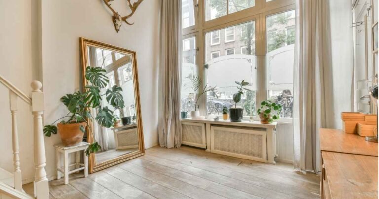
Curtain rods at ceiling height, extending 6–8 inches beyond the window frame on each side, make windows look significantly larger and ceilings feel taller. Use linen or cotton curtains in the same tonal range as the walls. When curtains and walls merge into one visual plane, the room reads as unified rather than divided into segments.
9. Place mirrors opposite a light source
A large mirror on the wall perpendicular to the window reflects light sideways across the room. A mirror on the same wall as the window does almost nothing. In narrow apartments under 10 feet wide, a full-length mirror leaned at a slight angle near the brightest corner can dramatically expand the perceived space.
10. Anchor every zone with a correctly sized rug
In a living area, the front legs of all seating should sit on the rug. Minimum sizes: 5×8 feet for a studio seating zone, 8×10 feet for a full living room. In a dining area, the rug should extend at least 24 inches past the chairs on all sides when they’re pulled back.
11. Limit each surface to one intentional object
Surfaces — side tables, shelves, windowsills — get one intentional object each. A single sculptural vase, one small plant, or a pair of candles that read as a unit. Two competing objects on the same surface give the eye nowhere to rest. This is the hardest rule and the one that does the most for a space.
How to budget a minimalist apartment redesign
Most small apartments don’t need a full restart. The biggest shift usually comes from editing what’s already there and making one or two targeted upgrades. A well-chosen rug at $150 does more than $500 in accessories scattered across the room.
Small apartment design budget tiers
| Tier | Budget range | Highest-impact moves |
|---|---|---|
| Entry level | Under $50 | Rearrange layout, swap bulb color temperature, edit every surface to one object |
| Mid-range | $50–$200 | Correctly sized rug, ceiling-height curtains, floating shelves |
| Higher investment | $200–$600 | Multi-functional furniture swap, two lamps, one large statement mirror |
| Full reset | $600+ | Bed frame with storage, modular shelving system, full palette refresh |
Materials that perform above their price point
| Material | Why it works in small spaces | Budget tier |
|---|---|---|
| Linen curtains | Diffuses light softly; reads as textural without adding color | Mid-range |
| Jute rug | Warm, natural; adds tactile contrast to hard floors | Budget to mid |
| Rattan or cane | Adds visual texture without visual weight | Budget |
| Matte ceramic vessels | Tactile and design-credible; never shiny or fussy | Budget |
| Bouclé throw or pillow | Adds warmth and depth without color complexity | Mid-range |
Quick checklist before you buy anything:
- [ ] Are all walkways at least 30 inches wide?
- [ ] Does each piece of furniture serve two functions?
- [ ] Is the rug large enough? (Front legs of all seating on the rug)
- [ ] Are curtain rods at ceiling height?
- [ ] Is every surface limited to one object?
- [ ] Is lighting layered from at least two different sources?
The Three-Zone Method for modern minimalist small apartment layouts
Most small apartment advice treats the space as a single room to optimize. The Three-Zone Method treats it as three distinct functional environments that share walls, and designs each one with its own spatial logic. It’s the clearest framework I’ve found for avoiding the “designed at once, looks like nothing” trap.
Zone 1 — the anchor zone: Where you spend the most time. Usually the living or seating area. It gets the largest rug, the layered lighting, and the most visual attention. One statement piece per zone; not three.
Zone 2 — the functional zone: Work surface, dining table, kitchen counter. Edited to near-zero: clear surfaces, only what’s actively in use. Clutter here leaks visually into Zone 1 and collapses the feeling of space.
Zone 3 — the retreat zone: The sleeping area. Even in a studio, treat this as its own contained environment. A single nightstand, one lamp, one textile. Nothing else earns a place here.
The rule that holds all three together: storage facing Zone 2 should have closed fronts when viewed from the other zones. Open shelving always faces inward toward its own zone only.
Why warmth beats whiteness
I restyled a 340-square-foot studio over one weekend on a $220 budget. The space had stark white walls, a single 4000K overhead LED, and furniture flush to every wall. Two changes did 80% of the visual work: swapping to 2700K bulbs and two secondhand floor lamps ($35 combined), then pulling the sofa 4 inches from the wall and rotating the rug from lengthwise to diagonal. No new furniture, no painting. The diagonal rug made the room look wider, not smaller. And the bulb change made the white walls read as soft chalk rather than clinical white. The walnut floor finally glowed the way it was supposed to.
Common mistakes in minimalist apartment design
These are the errors I see most often in small apartments. Every single one is correctable without significant cost or disruption. Most require nothing more than a different decision about what’s already in the room.
Mistake 1: Treating minimalism as emptiness
A room with only a sofa and a rug isn’t minimalist. It’s unfinished. If a room feels cold, texture is almost certainly missing. Add one textile layer before removing anything else.
The fix: One object per surface, no more than three visible decor pieces in any single zone.
Mistake 2: Getting the rug size wrong
If all four legs of the sofa sit off the rug, it’s too small. No other change will fix the room until the rug is the right size.
The fix: Test the correct size with painter’s tape on the floor first. In most living areas, 8×10 feet is the practical minimum.
Mistake 3: Relying on one overhead light
A single ceiling fixture casts flat, even light that removes shadow and depth. It makes minimalist design look harsh rather than calm.
The fix: Turn off the overhead. Add a floor lamp and a table lamp at two different heights.
Mistake 4: Mixing too many hardware finishes
Varying metals across fixtures, cabinet handles, and furniture legs creates visual noise that decluttering won’t fix. Repetition reads as intention; variety reads as indecision.
The fix: Choose two finishes and repeat them throughout: matte black with natural oak, or warm brass with walnut.
FAQs
Won’t an all-white small apartment feel cold and sterile? Often, but it’s not the white; it’s the bulb temperature. A white wall under 4000K cool-white LEDs reads clinical. The same wall under 2700K warm-white light reads calm and intentional. Change the bulbs before you repaint.
How do I stay minimalist when I own a lot of stuff? Minimalism in a small apartment is about what’s visible, not what you own. Invest in closed-front storage (cabinets, baskets with lids, built-in wardrobes) that keeps possessions out of sightlines. Reserve open shelving for the 10–15% of objects you want to look at.
What’s the best furniture layout for a studio apartment? Divide the studio into two or three zones using a low shelving unit or a rug boundary. Place the sofa with its back toward the sleeping zone to create a psychological divide. Avoid any furniture taller than 42 inches in the center of the space.
What colors work best for modern minimalist small apartment design? Warm neutrals outperform stark whites in most apartments. A chalky off-white, a light warm beige, or a muted warm greige holds up across changing light conditions throughout the day. Bring contrast through one dark accent, such as a black lamp base or walnut shelf edge, not a full feature wall.
Do I need to repaint to get a minimalist look? No. Ceiling-height curtains in the wall’s tonal range, layered warm lighting, and edited surfaces produce a comparable shift without touching the walls once, which matters particularly for renters.
Put the space to work
Modern minimalist small apartment design is less a visual style and more a decision process: what earns its place, and does its presence make the room feel better or more crowded. Start with the rug size, the lighting temperature, and the walkway clearances. Those three moves change how a space feels before you spend anything significant on decor.
Use the Three-Zone Method to break the apartment into manageable parts. Design each zone with a clear function before moving to the next.
For more practical small-space guides on furniture selection, apartment-friendly storage, and wall treatments that work without a landlord’s permission, Home Decor Ideas covers the specifics that broad design advice tends to skip.
Ready to take the next step? Our proven track walks you straight to better outcomes.