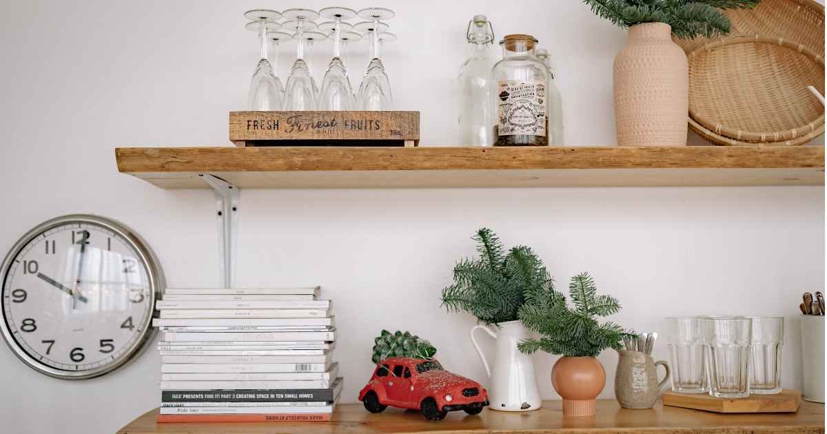
Floating shelf decor ideas for living rooms look simple on paper — put things on the shelf, done. But walk into most homes and those shelves feel off: objects crammed together, no real rhythm, and a vague sense the wall would look better empty.
The issue isn’t the shelves. It’s the approach. Most people place items one by one until the surface looks full, then stop. The result is visual noise rather than a styled display.
This guide covers 15 specific ideas, a shelf-by-shelf arrangement method you can apply in one afternoon, and the most common mistake I see on nearly every set of shelves. That last part is in the mistakes section — don’t skip it.
Key takeaways:
- Style shelves in groups of three or five objects, not pairs
- Every shelf needs one anchor — a taller or visually heavier piece that grounds the display
- Leave 20–30% of each shelf surface empty; that negative space is doing active design work
- Mix textures (matte ceramic, raw wood, trailing plant) more than you coordinate colors
- Standalone floating shelves look best mounted 54–60 inches from the floor
- Horizontal book stacks create pedestals; books styled only vertically produce a flat visual horizon
What makes floating shelf decor actually work
The gap between a shelf that looks intentional and one that looks accidental comes down to visual weight distribution. A well-styled shelf has contrast in height, texture, and density — and it leaves breathing room between those elements. Styling by instinct tends to produce the “row effect”: objects at the same height, evenly spaced, reading more like a store display than a home. The fix is a clear method, which the Anchor-Layer-Air section covers in full.
Visual weight and how it shapes a display
Visual weight describes how heavy or light an object looks, regardless of its actual mass. A dark matte vase reads heavier than a clear glass one the same size. A dense cluster of books reads heavier than a single sculptural piece with open air around it. Balancing visual weight stops a display from feeling lopsided — it’s why one large piece with two smaller ones usually reads better than three objects of equal size.
Why negative space is an active design element
Negative space is the empty area left on a shelf. It’s not a gap to fill — it’s what lets the eye move between objects without confusion, and it makes the objects around it more visible, not less.
Pro tip: If you can’t decide what to remove, photograph the shelf on your phone. Crowded shelves always read as clutter in photos, even when they feel acceptable in person. Ten seconds of photo review almost always clarifies the edit.
15 floating shelf decor ideas for the living room
Each idea below includes a specific, usable detail: a measurement, a material, or a placement rule — not a vague concept.
1. Lean framed art against the shelf back
Instead of hanging art on the wall above the shelf, lean a small framed print directly against the back surface. Frames under 5 × 7 inches suit narrower shelves; 8 × 10 or A4 size works on shelves at least 5 inches deep. This creates a gallery-within-a-display effect and adds depth that most people haven’t tried. In my experience, this single move changes a shelf’s character more than almost any new purchase.
2. Alternate horizontal and vertical book stacks
Lay two or three books flat, then stand one upright beside the stack. The horizontal pile becomes a platform for a small object on top — a ceramic dish, a candle, a tiny plant. This technique creates visual layering with items most people already own, at zero cost, and adds depth that a row of upright books alone never achieves.
3. Add a trailing plant
A pothos, string of pearls, or string of hearts gives a shelf what most objects can’t: movement. Place the pot near the outer edge so vines fall naturally over the side. Keep the pot simple — terracotta or matte white — so the plant is the focal point. A shelf with a trailing plant has a softness that ceramics and books alone can’t produce.
4. Group objects in threes and fives
Odd-numbered groupings look more natural than even-numbered ones. On a five-object shelf, aim for one tall piece, two at mid-height, and two low or flat items (a book stack, a small dish). Even numbers can work, but they need deliberate placement to avoid reading as paired and overly formal.
5. Anchor every shelf with a matte ceramic piece
Matte ceramics hold visual weight without competing with softer textures around them. A rounded vase, a sculptural bowl, or a simple cylinder in off-white, terracotta, or warm taupe works across Scandinavian, boho, transitional, and modern farmhouse interiors alike. Matte surfaces catch light differently as the day changes — something glazed pieces simply don’t do.
6. Vary height across at least three levels
Aim for three distinct height levels per shelf: tall (30+ cm or 12+ inches), medium (10–20 cm or 4–8 inches), and low or flat. When everything sits at the same height, the eye has no path to follow and the display reads as static. Height contrast alone creates visual rhythm across an arrangement.
7. Place one true anchor object per shelf
An anchor is the tallest, darkest, or most visually dominant piece. On a 90 cm (36-inch) shelf, one anchor grounds the display; on shelves over 120 cm (48 inches), two anchors balance the composition without splitting it. Position the anchor one-third from one end — not at the center — so the arrangement reads as curated rather than staged.
8. Bring in natural texture
Rattan, woven jute, raw wood, and unglazed clay all read as warm and tactile — exactly why they work on shelves in rooms that trend cool or minimal. A single rattan basket, small and lidded, introduces texture without visual noise; the woven surface also softens the hard horizontal line of the shelf itself. Getting the material mix right matters more than coordinating colors.
9. Add one small reflective element
A small round mirror or a metallic-finish piece — a brass candlestick, a ceramic with a high-gloss glaze — bounces light around the shelf and the surrounding wall. In living rooms with limited natural light, this noticeably brightens the display. Keep mirror diameter under 20 cm (8 inches) for shelf use; anything larger belongs on the wall, not on the shelf.
10. Cluster candles at varying heights
Two or three candles in different heights, all in the same color family (all white, all ivory, all matte black), add warmth without complexity. Place them on a small ceramic or marble tray to anchor the grouping. Mixing candle colors on a shelf pulls the eye away from the broader arrangement; a single color family keeps focus on the display as a whole.
11. Use book stacks as pedestals
Stack three or four books flat, then place a small sculptural object on top. The stack lifts the piece to a new height, creates a visual platform, and puts everyday objects to non-obvious use. Turn the spines inward on one or two books if their cover colors clash with surrounding pieces.
12. Let one shelf breathe
In a stacked set, let one shelf hold just one or two objects. A single ceramic vase on an otherwise open shelf reads as intentional and confident — a choice, not an oversight. It also gives the eye a visual pause between the denser displays above and below. Restraint is a design move, not a shortfall.
13. Match the shelf color to the wall
When a shelf matches the wall behind it — or comes very close — objects appear to float rather than sit on a plank. In smaller living rooms, this continuity also reduces the visual weight of the shelf edge and bracket. A simple repaint or restain achieves this at low cost and changes how the whole wall reads.
14. Repeat one accent color across all shelves
Pick one accent — deep terracotta, forest green, warm brass — and place one object in that color on every shelf in the set. The repetition pulls a multi-shelf display into a cohesive composition rather than a collection of unrelated groupings.
15. Mix materials before you mix colors
Before adding a new object, check: does this shelf already have ceramic, wood, and plant material? Those three categories together are almost always cohesive regardless of color. Letting the material variety do the coordination means you don’t need to overthink palette matching — and the shelf tends to look more considered for it.
How high should floating shelves be in your living room?
For a standalone display shelf, mount it 54 to 60 inches from the floor — roughly eye level when standing, visible from across the room, accessible without effort. Sets of stacked shelves follow different logic; the table below covers both.
Shelf height guide by setup
| Setup | Recommended height from floor | Notes |
|---|---|---|
| Single display shelf, 8 ft ceiling | 54–60 inches | Eye level when standing |
| Bottom shelf of a 3-shelf set | 30–36 inches | Low enough to reach, proportional to the set |
| Middle shelf of a 3-shelf set | 52–58 inches | Primary display zone |
| Top shelf of a 3-shelf set | 72–78 inches | Accent pieces only; harder to style |
| Shelf positioned above a sofa | 6–12 inches above sofa back | Maintains clearance and proportion |
| Room with ceilings 10 ft or higher | Scale each tier up 6–8 inches | Prevents shelves reading as too low |
Leave 12 to 16 inches between stacked shelves. Less than 12 inches makes it hard to fit taller objects or lean framed art. More than 16 inches can make a set feel disconnected, like two separate wall zones rather than one grouped display. In rooms with 8-foot ceilings, three shelves at 12-inch spacing is usually the practical maximum.
The Anchor-Layer-Air method: a framework for floating shelf styling
Most shelf-styling struggles come from having no clear starting move. The Anchor-Layer-Air method gives every floating shelf a first action, a layering step, and a finishing check. It takes about 20 minutes per shelf to apply and works across all interior styles.
Step 1 – Anchor: Place the tallest or most visually heavy object first. Position it one-third from one end — not at the center. A centered anchor produces the store-display look. Off-center begins the asymmetry that makes a shelf read as curated.
Step 2 – Layer: Add two to four mid-height and low objects around the anchor at different heights. Let pieces overlap slightly from the viewer’s angle — a book stack placed slightly in front of a vase, for example. This depth is what makes a flat shelf surface read as dimensionally layered.
Step 3 – Air: Remove one object, then assess whether another should go too. Target: 20 to 30% of the shelf surface remaining clear. That open space isn’t empty — it’s what makes the rest of the display legible from across the room.
Case study: three shelves, one Saturday afternoon, no purchases
I restyled three floating shelves in a 14 × 16-foot living room one Saturday afternoon using only objects already in the room. Before: 22 items spread across the three shelves, most of them small and nearly all at the same height. After applying Anchor-Layer-Air and editing down to 13 objects, the room felt noticeably larger — and two separate guests that week independently asked when I had “done something new” to the space. Nothing changed except the arrangement and the edit.
Shelf-ready checklist
Before calling a shelf done, run through this:
- One anchor object per shelf, positioned off-center
- Three distinct height levels present
- At least one natural texture (plant, rattan, wood, or unglazed clay)
- 20–30% of the shelf surface left open
- No two adjacent objects at the same height
- Viewed from 5 feet away, a clear visual center that isn’t the geometric midpoint
When Anchor-Layer-Air doesn’t apply
This method works on shelves at least 80 cm (31 inches) wide. On shelves narrower than 60 cm (24 inches), there isn’t enough surface for the layering in Step 2 to read from a normal viewing distance. On a narrow shelf, simplify: one anchor, one low piece. Nothing else.
Common floating shelf styling mistakes — and the fixes
Mistake 1: Perfect symmetry
Placing matching objects on either side of a center point reads as formal and hotel-lobby rather than personal and lived-in. Asymmetry feels more human. Fix: position the dominant piece one-third from one end, not at the midpoint.
Mistake 2: Crowding every inch
This is the pattern I find most often when helping someone restyle a room. Every surface occupied, objects touching, no open space anywhere. Fix: remove items until 20–30% of the shelf is clear. The instinct that says you’ve removed too much is usually accurate calibration — trust it.
Won’t shelves look bare with that much empty space? Not if the remaining objects vary in height and texture. Five well-placed pieces with breathing room consistently reads as more styled than 12 objects pressed together.
Mistake 3: Uniform height across every object
A line of similarly scaled pieces produces a flat horizon the eye skips past. Fix: add one object at least twice the height of the smallest piece on that shelf. Height contrast alone changes how a display reads.
Mistake 4: Avoiding heavier pieces out of weight concerns
Standard floating shelf brackets anchored into wall studs handle 20 to 45 kg (45 to 100 lbs) per bracket — far more than typical decor objects ever approach. A shelf that holds firm when pressed down firmly is safe for normal display use. If mounting into drywall without studs, use hollow-wall anchors rated for the specific load.
Floating shelf decor: what to do vs. what to avoid
| What to do | What to avoid |
|---|---|
| Group in odd numbers (3, 5, 7) | Use even groupings that read as paired |
| Leave 20–30% of the surface open | Fill every available inch |
| Vary height across three distinct levels | Align objects to one horizontal |
| Mix materials (ceramic, plant, wood) | Repeat the same material throughout |
| Position the anchor one-third from one end | Center the dominant piece |
| Use one trailing plant for movement | Cluster multiple live plants together |
| Match shelf color to wall color | Contrast the shelf edge sharply against the wall |
FAQs
What should I put on floating shelves in my living room? Mix three material types: something ceramic or glass, something natural (a plant, a rattan piece, or a wooden object), and something flat (a book stack or a small framed photo). Those three categories — hard texture, organic material, and a horizontal element — together make a shelf look deliberately arranged rather than randomly filled.
How many items should go on a floating shelf? For a 90 cm (36-inch) shelf, three to five objects is the practical range. Fewer than three can read as sparse unless the pieces are substantial; more than seven usually reads as cluttered. Odd-numbered groupings balance more naturally than even ones.
How do you style floating shelves without spending much? Start with what’s already in the room. Books, a plant cutting in a plain glass, a candle, a ceramic mug you like — edited to five or fewer pieces with varied heights and open space — reads more styled than a shelf of new objects placed without a clear method.
What is the best depth for a floating shelf in a living room? Eight to 10 inches (20–25 cm) handles most decor objects comfortably: small vases, books, plant pots. Shallower than 6 inches limits what fits usefully; deeper than 12 inches can feel visually heavy unless the surrounding wall is proportionally large.
Do floating shelves work in a small living room? Yes — especially when the shelf matches the wall color. Visual continuity between shelf and wall reduces the sense of something protruding into the room. Keep to three objects per shelf at most and favor pieces with lighter visual weight: slim ceramics, small plants, a couple of thin books.
Conclusion
Floating shelf decor for a living room is less about finding the right objects and more about arranging what you have with a clear method. Apply Anchor-Layer-Air, leave 20–30% of each shelf open, and remove one more piece before calling it done. Those three habits change how a shelf reads faster than any new purchase will.
For more room-by-room styling frameworks built on this level of practical detail, Home Decor Ideas covers every space in the house — no vague inspiration, just what works in real rooms.
Looking for answers? Find them in our warmly curated hub built just for you.