Most boho rooms fail the same way. They pile on textiles, plants, and thrifted objects until every surface fights for attention and the room reads as chaotic instead of curated. You want the collected, well-traveled look, but every guide online tells you to add more without saying when to stop.
The best boho home decor ideas start with three anchors: one grounded texture (a large woven rug), one warm natural material layer (wood or rattan furniture), and one plant or organic element per zone. Layer these three well and you can add collected pieces without the room tipping into clutter. Everything else supports that base.
Below are 12 tested ideas, a rule of three that prevents the “too much stuff” problem, and one mistake I still see in almost every boho room I visit.
Key takeaways:
- Boho works through layered texture, not accumulated stuff. Every layer has a job.
- The Boho Rule of Three anchors any room: three textures, three plant heights, three colors max.
- Warm 2700K lighting is what separates cozy-boho from cluttered-boho.
- Vintage or thrifted pieces (5 percent of the room) create authenticity that mass-produced “boho” items cannot.
- Group objects in odd numbers (three, five, seven) for the collected-not-styled look.
What actually makes a room read as boho
Boho decor works when three fundamentals line up: layered natural textures (jute, wool, cotton, wood, rattan), warm neutral colors as the base, and collected personal objects grouped in odd numbers. Boho fails when readers confuse layered with cluttered and add without editing.
Boho is layered, not accumulated
Real boho rooms have restraint hiding inside the visual richness. Every textile, plant, and object serves a purpose in the composition, and negative space between groupings gives the eye rest. Rooms that look boho but feel exhausting have skipped the editing step entirely, and no amount of new items will fix that.
Warm neutral base beats colorful chaos
Successful boho rooms use warm cream, terracotta, olive green, dusty rust, and soft ochre as their base palette, then add pattern through textiles and texture through natural materials. Rooms that lead with bright competing colors (teal, magenta, lime, orange all at once) rarely age well and photograph poorly under warm lighting.
12 boho home decor ideas that stay collected, not cluttered
These are the 12 ideas I return to in almost every boho room I style, in the order I usually apply them. Start with the grounded layer, then add texture, then the collected accents. Order matters more than the specific pieces.
Anchor the room with a large woven or kilim-style rug
Jute, hemp, sisal, or a flat-weave Turkish kilim in an 8 by 10 or larger size grounds the whole room instantly. Choose warm neutrals (cream, tan, rust) or a low-contrast pattern that reads as texture from across the room. Rugs under 6 by 9 make everything above them look marooned in space. Layered rugs (jute base with a kilim runner on top) add extra depth and warmth.
Layer three textiles per seating area
A wool or cotton throw draped over the sofa arm, three to five pillows in mixed textures (linen, bouclé, embroidered cotton, kilim), and one grounding rug beneath. Three textile layers reads as intentional. Adding four or five layers per seating area tips into visual noise. Stick to the same color family across textiles so pattern reads as pattern, not chaos.
Add plants at three different heights
One 5 to 6 foot floor plant (fiddle leaf fig, kentia palm, olive tree, or bird of paradise), one mid-height plant on a stand or shelf, and one small trailing plant on a mantel or high shelf. Three heights create the layered greenery boho rooms need. Faux plants work in low-light rentals, but stick to realistic textures like matte finishes.
Include vintage brass, ceramics, and wood objects
Thrifted brass candlesticks, hand-thrown ceramic bowls, a small carved wooden stool used as a plant stand. One vintage or handmade piece per surface adds the collected feel that mass-produced boho products cannot fake. Skip labeled “boho” decor at chain stores. A single 15 dollar thrifted brass tray adds more soul than a whole shelf of matching new items.
Mix warm woods across the room
Walnut, teak, oak, rattan, cane, and bamboo. Boho tolerates multiple wood tones as long as they share warm undertones. A walnut coffee table, a rattan armchair, and a cane sideboard work together because the temperature is consistent. Avoid mixing cool-gray driftwood with warm walnut in the same room since the tones fight each other visually.
Choose a warm neutral base with one earth accent
Cream, oatmeal, and soft ochre walls set the boho base perfectly. Add one accent color pulled from nature: terracotta, olive green, rust, mustard, or dusty pink. Skip cool grays and stark whites since they cancel the warmth that makes boho rooms feel inviting. A room with a warm base and one earth accent reads as calm and layered, not busy.
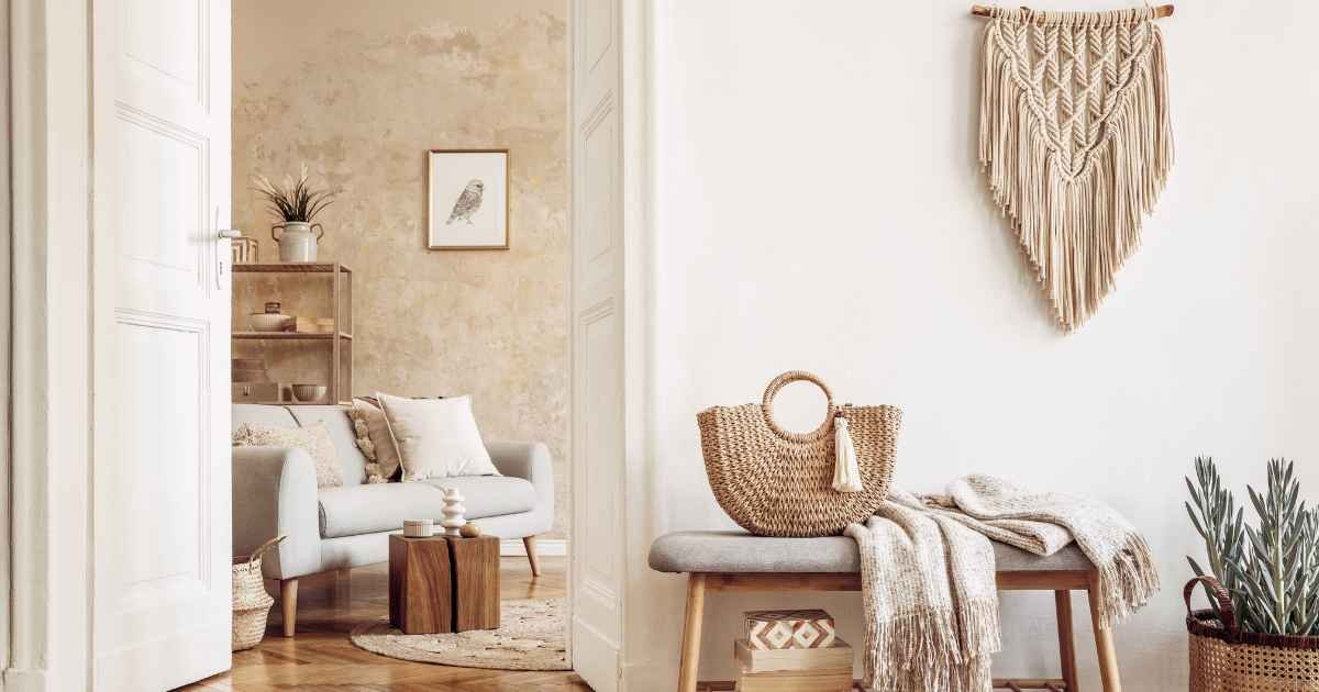
Add a macramé or woven wall hanging
A large macramé piece, a woven fiber wall hanging, or a hand-loomed cotton textile hung so the top edge sits at 65 inches from the floor. Aim for a piece at least 30 by 40 inches on any main wall. Wall hangings soften acoustics in echoing rooms and add texture where art alone would feel cold or generic in a boho context.
Layer warm 2700K lighting at three heights
Overhead pendant or rattan fixture, eye-level table lamp with a linen or paper shade, and a floor lamp with a warm bulb. All in 2700K. Consistent warm lighting is what turns collected objects into curated composition instead of yard sale. Cool white bulbs make even the best boho styling look flat and unflattering to every fabric in the room.
Display collected books, ceramics, and objects on open shelves
Boho shelves work best when they mix book stacks (some vertical, some horizontal), one or two ceramic vessels, a small trailing plant, and one framed art piece leaning at the back. Aim for 60 percent styled and 40 percent negative space per shelf. Overstuffed shelves photograph as chaos. Well-edited shelves photograph as personality.
Add one organic-shaped or arched element per room
An arched mirror leaning against a wall, a curved rattan headboard, a round jute pouf, or a wavy sculptural vase. One organic curve counters the straight lines of walls and windows, and softens the overall composition. Arches especially read as boho because they evoke Moroccan and Mediterranean architectural forms without needing to copy them literally.
Layer patterns from the same color family
A kilim runner, a block-print pillow, a small floral throw, and a striped cushion can all work together if they share the same warm neutral color story. Aim for two to three patterns per seating area, spaced so they don’t touch. Patterns from clashing color families (bright turquoise plus warm rust) create the busy chaos that reads as failed boho.
Include one grounded, substantial furniture piece per room
A low-slung linen sofa, a heavy oak dresser, or a chunky wooden dining table. Boho rooms fail when every piece feels lightweight, scattered, or temporary. One substantial anchor per room gives the visual composition weight and prevents the whole space from feeling like a collection of throw pillows and dried grasses waiting to be blown away.
Boho materials, budgets, and the numbers that matter
Most boho decor mistakes come down to material choices, not styling. Pick synthetic textiles and cheap “boho” branded pieces and the room reads as forced. Pick real natural materials at any budget tier and the room reads as authentic. These tables give the numbers I check before recommending anything.
Boho materials that photograph well vs. materials that don’t
| Photographs well | Photographs poorly |
|---|---|
| Jute, hemp, sisal, wool rugs | Synthetic shag or polyester rugs |
| Linen, cotton, bouclé textiles | Glossy polyester, faux velvet |
| Rattan, cane, seagrass furniture | Painted plastic wicker imitations |
| Matte ceramic, unglazed pottery | Glossy factory ceramic in bright colors |
| Warm brass, aged copper | Chrome, rose gold, brushed nickel |
| Vintage or handmade objects | Mass-produced “boho” branded items |
Where your budget lands
| Budget tier | Prioritize | Realistic impact | Time to install |
|---|---|---|---|
| Under $100 | 2700K warm bulbs, thrifted brass, one plant | Warm light, first vintage layer | One evening |
| $100 to $500 | Jute or kilim rug, three textiles, three plants | Grounded layer, greenery | One weekend |
| $500 to $1,500 | Rattan chair, macramé wall hanging, wood coffee table | Full texture layer | One weekend |
| $1,500 to $5,000 | Vintage sofa or dresser, quality rug, curated art | Anchor pieces, lasting depth | Two weekends |
Pro tip: Buy the rug first, then work outward from there. Most boho rooms fail because the rug is too small or too synthetic. A large jute or wool rug sets the entire room’s texture temperature, and every other piece scales around it. Skip the small polyester rugs that ship free.
The Boho Rule of Three
Every well-styled boho room I’ve built follows the same rule at three scales. Three textures per seating area. Three plant heights per room. Three colors max in the base palette. Miss the rule at any scale and the room tips into either sparse (too few) or chaotic (too many). This framework works for studios, whole homes, or single vignettes.
Three textures per zone
Every seating area, dining zone, or bed area should have three distinct textures competing for the eye’s attention, no more. Wool throw + linen curtains + cane sideboard, for example. Four textures per zone starts reading as noisy, and two feels sparse. Three is the boho balance point that photographs well and lives in comfortably.
Three plant heights per room
Floor-level (5 to 6 feet), eye-level (30 to 50 inches on a shelf or stand), and hanging or trailing (mantel, high shelf, or ceiling hook). Three heights per room create the layered greenery boho rooms need. One plant per room reads as under-decorated. Six plants at the same height reads as forgotten jungle.
Three colors max in the base palette
Warm cream, terracotta, and olive green, for example. Or oatmeal, rust, and soft ochre. Three colors give enough variation to feel layered without competing. Any additional color should show up only in small accent objects (a single vase, one book spine), never as furniture upholstery or wall paint that dominates the eye.
Case study: layering a 200-square-foot bedroom for $220
I restyled a 200-square-foot bedroom over two weekends on a $220 budget. Textures: added a $90 jute rug, a $35 vintage kilim runner on top, and a $25 wool throw. Plants: placed a 6-foot kentia palm (already owned) plus two $20 mid-height pothos on a shelf. Objects: grouped $30 in thrifted brass candlesticks, a ceramic bowl, and an old book on the dresser. Lighting: swapped every bulb for 2700K warm at $8 total. The room went from generic rental to layered boho without buying a single “boho” branded product.
Weekend one checklist:
- Change every bulb in the main room to 2700K warm
- Buy or thrift the biggest natural-fiber rug you can afford
- Add three plants at three different heights
- Layer three textiles in one seating or sleeping area
- Group three or five vintage objects on one surface
Common boho decor mistakes (and how to fix them)
Some mistakes come up in almost every boho consult I do. Most aren’t about taste. They’re about assuming more equals better, which flips boho from layered into cluttered fast.
Mistake 1: Overcrowding every surface
Fix: apply the Boho Rule of Three at surface scale. Group three or five objects per surface, then leave the rest empty. Coffee tables should have one book stack, one candle or vessel, and one small object. Not seven. Restraint is what makes the styling read as intentional instead of dusty.
Mistake 2: Using cool 5000K bulbs everywhere
Fix: swap every overhead and lamp bulb for 2700K warm bulbs. Cool white light cancels the warmth that makes boho rooms feel inviting. All the jute, brass, and terracotta in the world will look flat under blue-tinted lighting. Warm lighting is the multiplier that makes every other boho choice work.
Mistake 3: Buying “boho” branded items instead of real materials
Fix: shop for materials, not labels. A real jute rug from any store beats a polyester “boho” branded rug marketed as jute-look. A thrifted brass tray beats a spray-painted new one. Read materials tags carefully and prioritize wool, cotton, linen, jute, rattan, and solid wood over synthetic imitations.
Won’t boho decor always look messy or cluttered?
Not if the Rule of Three holds at every scale. Boho fails when styling accumulates without editing. Layered boho follows restraint hiding inside visual richness: three textures, three plant heights, three colors, groups of three or five objects. Add negative space between groupings. Cluttered boho happens when the editing step gets skipped, not when the style itself fails.
Isn’t boho already dated as a decor style?
Certain trend versions are (mushroom lamps, macramé wall art from a specific viral moment). But the underlying principles (natural materials, layered textures, warm neutrals, collected objects, indoor plants) have been core to interior design for many decades. Real boho ages well because it’s built on materials that improve with time. Trendy boho dates fast.
FAQs
These are the questions readers ask most often about boho home decor ideas when starting out or refreshing a tired boho room.
What defines boho home decor? Layered natural textures (jute, wool, rattan, wood), a warm neutral base palette with earth accents, indoor plants at multiple heights, and collected vintage or handmade objects grouped intentionally. Boho borrows from Moroccan, Turkish, and mid-century global traditions without literally copying any single one. Its core is layered warmth, not accumulated stuff.
What colors are considered boho? Warm cream, oatmeal, terracotta, rust, olive green, dusty ochre, soft brown, and muted pink form the classic boho palette. Skip cool grays, bright saturated colors, and pure whites. Boho works best in warm earth tones lit by 2700K warm bulbs. Adding one saturated accent (deep teal or plum) works only if the base stays warm.
How do you make a room look boho without going overboard? Follow the Rule of Three at every scale. Three textures per seating area, three plant heights per room, three colors in the base palette, and groups of three or five objects on each surface. Add negative space between groupings. Edit ruthlessly. Restraint is what separates layered boho from cluttered boho every time.
What’s the difference between boho and bohemian? They’re essentially the same style. “Boho” is the shortened, popularized version of “bohemian” that spread through interior design in the last two decades. Traditional bohemian refers to a broader lifestyle and artistic movement, while boho decor is the visual language: natural materials, layered textiles, warm colors, and collected objects.
Is boho decor still popular? Yes, especially the warm, edited version that borrows from Moroccan, Japanese, and Mediterranean traditions. Trendy versions with specific viral shapes (mushroom lamps, bright macramé) come and go, but the underlying principles of layered natural texture and warm neutrals have stayed relevant across many decades and will keep doing so.
Where to start
Boho home decor ideas come down to layered restraint, not accumulated stuff. Right rug. Right lighting. Right rule of three at every scale. Once those line up, the collected objects and vintage finds you add on top do what they’re supposed to do: give the room personality without tipping into chaos. Start with the Rule of Three, buy your rug this weekend, and let everything else layer around it. HomeDecorIdeas has room-by-room guides if you want to go deeper on any of these fixes.