A console table in your entryway is either the first thing guests notice or the last thing you think about. Most people fill the surface with mail, keys, and a candle that’s never been lit. The result: a table that looks busy but says nothing.
Knowing how to style a console table entryway comes down to three things: proportion, layering, and intention. This guide walks you through a clear, repeatable method that works whether your entry is 6 feet wide or barely fits the table. And that mistake in the last section? It shows up in nearly every home I’ve seen.
Key takeaways:
- Your tallest object should reach no more than two-thirds of the distance between the tabletop and the ceiling
- A mirror hung 6 to 8 inches above the table surface hits the right proportion and stays functional
- Group objects in odd numbers across three distinct heights, with at least one organic texture
- Leave 30 to 40 percent of the tabletop empty — negative space is a design choice, not an oversight
- Anchor the entire arrangement with one dominant piece before placing anything else
- Functional items like a key tray belong in the design, not hidden from it
What a console table actually does in an entryway
A console table pulls three duties at once: it anchors the visual field you see when you enter, provides a surface for transitional items like keys and bags, and signals the design language of the rest of your home. Get all three right and the entry feels considered. Prioritize one at the expense of the others and the whole thing reads as unfinished.
Choosing the right size before you style anything
Size is the one decision you can’t fix with objects. A console table should sit at a standard height of 28 to 32 inches and run to roughly two-thirds the width of your entry wall, not the full width. Depth matters just as much: 12 to 16 inches keeps walkways clear without sacrificing surface space.
You need at least 30 inches of clearance between the front of the table and any opposite wall or door. Less than that, and the entry feels like a bottleneck regardless of how well the table is styled.
How to style a console table entryway, step by step
Styling a console table entryway starts with one anchor piece, then builds outward in layers until the surface feels considered rather than crowded. Follow this sequence and you can apply it to any entry, in any size space.
Step 1: Choose one anchor piece
Every well-styled console starts with a single dominant object that everything else responds to. This is usually the tallest item on the surface: a large lamp, a sculptural vase, or a framed print propped against the wall. Pick one. The anchor gives the arrangement a clear visual center of gravity, and without it, everything competes for attention at once.
Lamps are the strongest anchors because they serve a functional purpose while drawing the eye upward. A ceramic table lamp in a matte finish tends to age better than a glossy metallic one, and it works with more wall colors.
Step 2: Hang the mirror or wall art at the right height
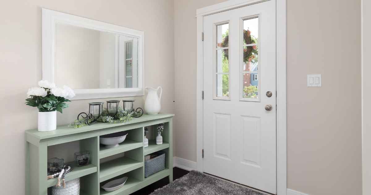
Hang a mirror or piece of wall art 6 to 8 inches above the table surface, not at eye level. Any higher and the mirror starts to feel disconnected from the table below; any lower and it gets visually absorbed into the surface objects. A round mirror above a rectangular table creates a pleasant contrast in shapes, keeping the arrangement from reading as too rigid.
Width matters here too. The mirror or art should span roughly 50 to 75 percent of the table’s total width. Wider than that and it overwhelms the table; narrower and it looks mismatched.
Step 3: Build three height zones across the surface
Once the anchor is placed, organize the remaining objects into three height zones: tall (handled by your anchor), medium (a small plant, a shorter vase, or a stack of two or three hardcover books), and low (a tray, a flat candle, or a small sculptural object). These three zones create a diagonal rhythm that makes a flat surface look considered.
Odd numbers hold up better than even groupings. Three objects, five objects, or seven. Even-numbered arrangements tend to feel static.
Step 4: Include one organic texture
Every styled surface needs something that isn’t perfectly formed. A rough linen-textured vase, a dried botanical stem, a terracotta pot, a rattan basket, or a woven runner all break the visual monotony of smooth, hard objects. One organic element is what separates a styled table from a merchandise display.
Step 5: Add one living element
A plant or fresh stem adds life, but it also demands upkeep. If you know you’ll neglect it, a high-quality faux plant in a real ceramic pot reads far better than a struggling real plant in a plastic nursery container. The pot matters more than whether the plant is real.
Step 6: Corral functional items with a tray
Keys, loose change, and sunglasses will land on this table whether you design for them or not. A shallow tray in a neutral finish (matte black, natural wood, or aged brass) corrals those items and makes the clutter feel placed rather than dropped. Set the tray at one end of the table, not centered, so it anchors a corner without dominating the whole surface.
Step 7: Protect the negative space
Pro tip: Around 30 to 40 percent of the tabletop should stay clear. That open space isn’t emptiness. It’s what makes the styled objects feel deliberate. Without it, even a beautiful arrangement starts to look like someone just kept adding things.
Console table styling: do’s and don’ts
| Do | Don’t |
|---|---|
| Group objects in odd numbers at three heights | Line up objects of the same height |
| Hang mirrors 6–8 inches above the table surface | Hang mirrors at standard eye level |
| Leave 30–40% of the tabletop empty | Fill every inch of surface space |
| Mix textures: smooth, rough, and organic | Match every finish and material |
| Anchor with one dominant vertical piece | Place multiple competing focal points |
| Tuck one functional item into the arrangement | Hide keys and mail in a drawer and call it done |
Proportions and sizing: the numbers that matter
Most console table styling mistakes aren’t about the wrong objects. They’re about the wrong scale. This reference table takes the guesswork out of placement decisions.
Console table proportion guide
| Element | Ideal measurement |
|---|---|
| Table height | 28–32 inches |
| Table depth for entryway use | 12–16 inches |
| Mirror or art width | 50–75% of table width |
| Mirror hang height above table surface | 6–8 inches |
| Maximum height for tallest surface object | Two-thirds of the distance to the ceiling |
| Negative space to preserve | 30–40% of surface area |
| Minimum floor clearance in front of table | 30 inches |
What does styling a console table cost?
| Budget tier | What you’re working with |
|---|---|
| Under $75 | Thrifted lamp, secondhand mirror, one plant in a ceramic pot from a discount store |
| $75–$200 | Mid-range ceramic lamp, simple round mirror, two or three curated objects |
| $200–$500 | Statement mirror, quality lamp with a linen shade, objects with genuine material variety |
| Over $500 | Designer lamp, large-format art or custom mirror, handmade ceramic or artisan pieces |
The Anchor-Layer-Live method
Most styling advice tells you what to put on the table. This framework tells you how to think about it. The Anchor-Layer-Live method works in three phases, in sequence, and it scales to any table size or budget.
Anchor: Place one dominant vertical element first. Don’t move to the next phase until that decision is made. Everything else on the table will be a supporting player.
Layer: Add objects in at least two height zones below the anchor. Each zone should include something with visual weight (texture, color, or size) and at least one item that’s lighter and more delicate.
Live: Add one functional item and one living element. These two things stop the arrangement from looking like a hotel lobby vignette and make it feel like it actually belongs to someone.
A real restyle: 42-inch entry console, one afternoon, around $55
I restyled a 42-inch wide entry console in one afternoon using around $55 worth of thrifted and discount store finds. The original setup had three matching white vases of identical height — a textbook example of a flat, static arrangement. I replaced that trio with a single tall matte sage ceramic vase as the anchor, added a stack of two hardcover books at medium height, placed a small woven rattan tray at the low end for keys, and rehung the existing round mirror 6 inches higher on the wall.
The whole restyle took about 40 minutes. The entry looked finished for the first time. Height variation did more than any new purchase would have.
5 mistakes that flatten every entry console
Knowing how to style a console table entryway also means recognizing what to stop doing. These five mistakes show up constantly, often in combination.
Filling every inch of surface space
More objects don’t produce more style. An overcrowded console looks like a gift shop shelf. Edit until you can clearly identify the anchor piece. If everything is competing for attention, something needs to go.
Matching everything too precisely
A perfectly coordinated object set reads as a retail display rather than a home. Mix metals slightly (matte black alongside aged brass), combine smooth and rough textures, let pieces vary in age and origin. Coherence comes from a limited color palette, not from matching finishes.
Hanging the mirror at eye level instead of table level
This is the most common technical mistake, and it’s easy to make because eye level feels intuitive. But a mirror hung that high becomes wall art rather than a response to the table below it. If you can’t see the tabletop’s reflection while standing in front of the mirror, it’s too high. Drop it to 6 to 8 inches above the table surface.
Won’t a mirror make a narrow entry feel like a funhouse? No, and this is a genuine misconception. A mirror reflects whatever is already in front of it. In an entry with even modest natural light, it distributes that light and makes the space feel wider. The only real issue arises when the mirror faces a cluttered corner directly. In that case, try a slight angle or swap it for wall art instead.
Ignoring the floor beneath the table
The floor under a console table is styling territory. A pair of baskets, a small wooden stool, or a low potted plant at floor level connects the table to the room and adds storage where you need it most. A bare table base looks unresolved.
Skipping a dedicated light source
A single overhead bulb makes every surface look flat and every object look inexpensive. A lamp on the console table adds a warm secondary light source that changes the whole atmosphere of the entry. If running a cord isn’t practical, a battery-powered lamp with a warm color temperature around 2700K does the job just as well.
My console table has storage drawers. Do I still need to style the top? Yes, but with less intensity. If the drawers handle the functional load, simplify the surface to two or three objects and a plant. The Anchor-Layer structure still applies; you just need fewer pieces to complete each layer.
FAQs
What should I put on a console table in an entryway? Start with one tall anchor piece, either a lamp or a sculptural vase. Add a mirror or art 6 to 8 inches above the table surface. Fill in with two or three supporting objects at varying heights, include at least one organic texture like rattan or terracotta, and leave roughly a third of the surface clear.
How tall should a lamp be on a console table? On a standard 30-inch console table, aim for a lamp that stands 24 to 28 inches tall, bringing the total floor-to-shade height to around 54 to 58 inches. Taller than that and the lamp starts to dominate the space. A linen shade softens the light and keeps the look from feeling commercial.
Should a console table always have a mirror above it? Not necessarily. A mirror is the most practical choice because it bounces light and adds function in an entry, but a framed artwork, a pair of sconces, or a gallery arrangement works equally well. What matters is that something occupies the wall above the table. Leaving it empty splits the arrangement visually.
How do I style a very narrow console table? Prioritize vertical elements over surface spread. One tall lamp, one small vase, and a leaned print or mirror achieves more on a shallow table than a spread of horizontal objects. Skip the tray if it crowds the surface and use a wall-mounted hook beside the table instead.
Can I style a console table in a dark entryway? Yes, with some adjustments. Use a lamp to introduce warmth, choose objects in lighter tones (natural wood, off-white ceramics, soft muted greens), and use a mirror to reflect whatever light is available. Dark entries need more light sources, not a brighter overhead bulb.
Conclusion
Styling an entryway console table well isn’t about spending more or finding the right set of objects. It comes down to proportion, intentional layering, and protecting enough open space for the arrangement to feel placed rather than accumulated.
Start with one anchor piece, match the mirror height to the table rather than to eye level, build three height zones, and stop before you fill every inch. The Anchor-Layer-Live method gives you a repeatable sequence that holds up across table sizes and budgets. For more practical room-by-room guides, HomeDecorIdeas covers everything from furniture placement in tight spaces to budget-friendly decor refreshes that work without a full overhaul.
Unlock the power of knowledge—explore curated posts that tackle today’s biggest challenges.