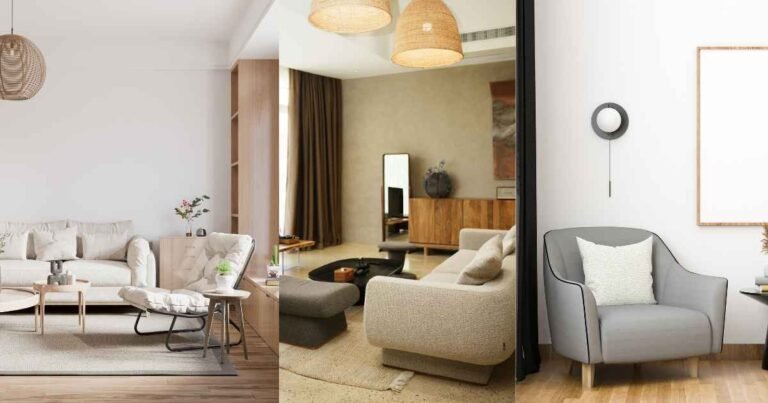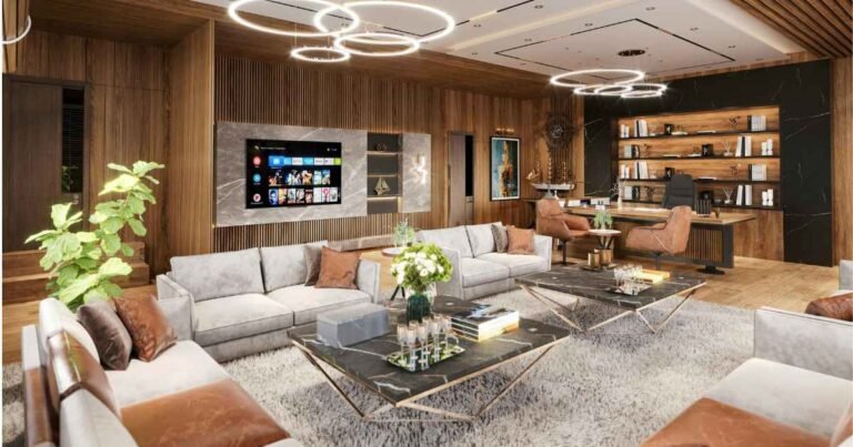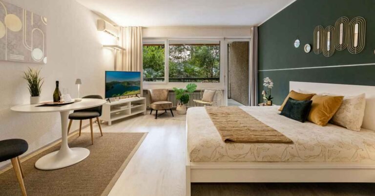

Walk into most budget-decorated homes and you can feel the price tag before you see it. Something’s off. The wood looks plastic, the lighting feels like a hospital corridor, and every surface holds three things too many. The frustrating part? The homeowner spent real money — they just spent it on the wrong things.
Here’s the direct answer: cheap home decor looks expensive when it borrows the habits of expensive rooms, not the price points. That means warm lighting, real materials over faux ones, restrained styling, oversized art, and consistent metal finishes. None of these cost more than $30 to fix in a single room. The wallet isn’t the problem. The choices are.
I’ve styled small budgets and larger ones side by side, and the visual gap between them is smaller than most people think. The last mistake in this article is the one I catch almost every reader making before they even realize it’s a habit.
Key takeaways:
- Warm 2700K lighting is the single fastest way to make any room read as high-end.
- Fewer, larger objects always look more expensive than many small ones.
- Real materials at any price beat faux materials trying to imitate them.
- Consistent metal finishes across a room signal designer intent.
- Oversized art and mirrors trick the eye into reading a space as premium.
- The 5-Signal Method (below) tells you exactly what expensive rooms have that cheap ones don’t.
What actually makes a room look expensive
Expensive rooms share five visual signals that have nothing to do with price. Warm layered lighting, restraint in the number of objects, honest materials (wood, stone, linen, ceramic), consistent metal finishes, and oversized statement pieces. Any budget can hit all five. The trick is knowing what to leave out, not just what to add.
Think of luxury as a set of habits, not a shopping list. A hotel suite feels expensive because everything in it has been edited. There are no cluttered shelves, no mismatched finishes, no cold overhead-only lighting. Even the plants are chosen for shape, not because someone thought the corner looked empty.
The five signals expensive rooms share:
- Layered lighting at three different heights minimum
- One clear focal point per room (art, mirror, or fireplace)
- Two to three textures maximum per surface
- Metal finishes matched across hardware, lamps, and frames
- Real materials over faux versions, even in small doses
Once you see these signals, you can’t unsee them. And they’re all replicable for under $200 in a whole apartment.
17 cheap ideas that read as high-end
These are ranked by visual impact per dollar spent, not by ease. Every one has been tested in real rooms with real dimensions. Pick three or four per space — you don’t need all seventeen.
1. Swap every bulb to 2700K warm white
Most rentals and starter homes ship with 4000K or 5000K bulbs that make wood look gray and skin look sick. Warm 2700K bulbs cost $8 to $14 for a four-pack and instantly make everything else in the room look more expensive. Change every bulb in one afternoon. This one habit does more than any single furniture purchase.
2. Add a floor lamp with a linen or paper shade
A single tall floor lamp with a warm bulb, placed next to a chair or in an unused corner, adds height and drama. Linen shades diffuse light beautifully; paper shades give a Japanese-modern feel. Thrifted bases in brass or matte black run $15 to $30. Skip glossy plastic shades — they always read cheap.
3. Frame oversized art on one large wall
One large piece of art (24×36 inches or larger) reads as high-end. Four small mismatched prints don’t. Free public-domain art from museum sites, printed at a copy shop on matte paper, framed in a thrifted or discount frame, costs $25 to $50 total. Hang the center of the piece 57 to 60 inches from the floor.
4. Layer a small rug over a larger one
The layered rug is a designer signature. Start with a natural fiber base (jute or sisal, 5×8 or 6×9 feet) and layer a smaller patterned rug at an angle on top. Total cost with discount and secondhand sources: $70 to $130. The layering hides low-pile wear on the top rug and adds instant depth.
5. Replace all cabinet hardware in one finish
Mismatched or dated hardware kills a kitchen faster than anything else. A set of matte black, aged brass, or unlacquered brass pulls runs $16 to $35 online. Measure the existing hole spacing first (3, 3.75, or 5 inches center-to-center is standard). Install in twenty minutes with a screwdriver.
6. Add tall stems or branches in a floor vase
A single tall floor vase (24 inches or taller) with dried pampas grass, eucalyptus branches, or curly willow reads as intentional styling. Thrifted vases in stoneware or matte ceramic cost $8 to $20. Dried stems from a craft store run $10 to $25. Place in an empty corner, not on a surface.
7. Hang curtains high and wide
Curtain rods mounted tight to the window frame make rooms look shorter and cheaper. Mount the rod 4 to 8 inches above the frame (or to the ceiling in low rooms) and extend it 6 to 10 inches past each side. Curtains should just kiss the floor. Total: $30 to $70 per window.
8. Paint trim the same color as the walls
White trim on colored walls creates a boxy, builder-grade look. Painting trim and walls the same color (in different sheens — matte walls, satin trim) creates a modern seamless look for the cost of one gallon of paint. Deep greens, warm charcoals, and terracotta all work.
9. Add a large round mirror
A round mirror, 30 inches or larger, hung above a console or on a blank wall, bounces light and doubles the visual size of a room. Thrifted round mirrors run $15 to $40; discount stores carry them for $40 to $80 new. Skip ornate frames — thin brass or matte black rings look most expensive.
10. Style with fewer, larger objects
Three larger objects always look more expensive than nine small ones. On a coffee table, use a stack of two hardcover books, one ceramic bowl or tray, and one small plant or candle. That’s it. Empty surface reads as intentional. Cluttered surfaces read as unfinished.
11. Add stone or marble accents in small doses
A real marble cutting board on a kitchen counter, a small stone tray on a bathroom vanity, or a travertine coaster set on a coffee table all signal luxury for $15 to $40. Faux marble contact paper works only on tiny surfaces where the pattern doesn’t repeat visibly.
12. Repaint a thrifted piece in a saturated color
A $20 secondhand side table or dresser, sanded lightly and repainted in a saturated color (deep green, oxblood, mustard, ink blue), reads as a designer find. Use a small foam roller for smoothness and apply two thin coats. Add new brass or matte-black hardware. Total: $30 to $55 including paint.
13. Add molding or trim to a plain wall
Applied wall molding creates the look of custom millwork for $30 to $80 per wall. Basic pine or MDF trim, cut into rectangles with a hand saw or miter box, glued and nailed to the wall, painted the same color as the wall, gives a Parisian-apartment feel. Best in dining rooms, entryways, and bedrooms.
14. Group candles on a slim tray
Three unscented pillar candles in different heights, placed on a slim marble, wood, or brass tray, on a dining table or coffee table, cost under $30 and read as European styling. Real wax only. Battery-powered LED candles flicker unnaturally and always look cheap on camera.
15. Replace plastic switch plates with metal
An unnoticed upgrade with outsized effect. Plastic almond outlet covers and switch plates date a room instantly. Brushed nickel, matte black, or unlacquered brass covers run $8 to $15 for a pack. Combined with new matte-black light switches ($3 to $5 each), the change looks like a renovation.
16. Add a chunky knit or bouclé throw
A single throw blanket in real wool, chunky knit, or bouclé, draped loosely over the arm of a chair or the corner of a bed, adds texture that photographs as expensive. Skip acrylic throws with obvious shine. A quality wool blend runs $25 to $50 at discount home stores.
17. Style shelves with books, ceramics, and one plant
Bookshelf styling is where most homes go wrong. Use three elements only: horizontal book stacks (spines out or turned inward for a neutral look), one ceramic or stoneware object per shelf, and one trailing plant. Leave one third of each shelf empty. Total styling cost: $0 to $40 depending on what you already own.
Cost comparison: cheap vs. expensive versions
You don’t need to spend more. You need to spend on the right things. Here’s what actually separates budget-looking rooms from ones that read as high-end.
| Element | Cheap-looking version | Expensive-looking version | Cost difference |
|---|---|---|---|
| Overhead lighting | 4000K “daylight” bulb | 2700K warm bulb | $0 to $3 |
| Coffee table styling | 9 small trinkets | 3 larger objects | $0 (remove things) |
| Curtain rod position | Mounted tight to frame | Wide and high | $0 (rehang existing) |
| Rug size | Small, floating | Sized so front legs touch | $20 to $60 up |
| Wall art | Multiple small prints | One oversized piece | Same or less |
| Metal finishes | Mixed randomly | Consistent throughout room | $16 to $35 |
| Vase / stems | Small faux flowers | Tall dried branches | $10 to $25 |
| Throw texture | Acrylic shine | Wool or boucle matte | $15 to $30 up |
| Trim paint | White on colored walls | Same color, different sheen | Same cost |
| Bookshelf items | Filled to the edge | One third empty | $0 (remove things) |
Pro tip: Before buying anything new, remove half of what’s currently on your open surfaces. Take the removed items out of the room entirely. Come back in an hour. Nine times out of ten, the emptier version looks more expensive than the fuller one, and you haven’t spent a dollar.
The 5-Signal Method for making cheap decor look expensive
Every high-end room hits all five signals below. Missing even one is what makes a budget room read as budget. Work through these in order.
Signal 1 — Warm layered light (three sources minimum)
Ceiling fixture with a 2700K bulb, plus one lamp at seated eye height, plus one lamp lower or higher. Never a single overhead light source. This one signal accounts for maybe half of what makes a room feel expensive.
Signal 2 — One clear focal point
Every expensive room has an obvious visual anchor: a large piece of art, a mirror, a fireplace, or a statement piece of furniture. Cheap rooms have three or four competing focal points. Pick one per room and let everything else defer to it.
Signal 3 — Restraint on every surface
Three items per surface, maximum. Two thirds of every shelf empty. A dining table with one bowl and one taper candle, not a runner and a centerpiece and coasters and salt-and-pepper shakers. Restraint is free and instantly reads as luxury.
Signal 4 — Matched metals
Pick one finish per room and stick to it: matte black, aged brass, unlacquered brass, brushed nickel, or chrome. All hardware, lamp bases, curtain rods, and frame edges follow that one finish. Mixed metals can work at a professional level, but consistency is the safer route on a budget.
Signal 5 — Real materials over faux
Even in small doses. One real marble coaster beats a whole faux marble contact-paper surface. One real wool throw beats three acrylic ones. One real stoneware bowl beats five resin decorative pieces. Your eye reads texture and weight before it reads shape.
Case study: an $85 living room refresh in one Saturday
I refreshed a friend’s rented 14×16 living room on an $85 budget in a single Saturday. Warm 2700K bulbs for the ceiling fixture and existing floor lamp: $12. One oversized public-domain print (24×36 inches), printed and framed in a thrifted frame spray-painted matte black: $28. A large round thrifted mirror over the console: $22. A single dried pampas stem in an existing vase, and every trinket on the coffee table removed except one hardcover book stack and a ceramic bowl she already owned: $10 for the stem, $0 for the editing.
Total: $72, leaving $13 unspent. She thought I’d spent three times that. The single most powerful change wasn’t the mirror or the art. It was removing seventeen small items from her open shelves and coffee table before I bought anything.
Common mistakes that keep rooms looking cheap
Every one of these is fixable in an afternoon and free (or nearly so). These are the traps I see over and over.
Mistake 1: Too many small decorative items
Multiple $5 objects always read cheaper than one $30 object, even at the same total spend. Small trinkets crowd the eye and dilute focus. The fix: Return half of what’s on your shelves and coffee table. Empty surface is a design choice, not a failure. If you must fill it, use one larger piece instead of five small ones.
Mistake 2: Cold overhead-only lighting
A single 4000K or 5000K bulb overhead flattens every surface and makes wood, fabric, and skin look worse. The fix: Every bulb to 2700K, and add at least two additional light sources per main room. Turn off the overhead entirely once lamps are in place. Rooms should be lit like restaurants, not like offices.
Mistake 3: Mixed metal finishes across one room
Brass door handles, chrome cabinet pulls, matte black light fixtures, and silver frames all in the same room create visual chaos. The fix: Pick one dominant finish per room. Replace the outliers first (cabinet hardware is usually the easiest and cheapest swap). Consistent metals cost the same but signal designer intent.
Mistake 4: Wrong-scaled rugs
A rug that only sits under the coffee table, with furniture legs floating on hardwood or tile around it, shrinks a room. The fix: The front legs of every seat should touch the rug. If they can’t, the rug is too small. Go up one size, even if it means choosing a cheaper material to hit the size.
Mistake 5: Filling every surface
This is the mistake I see almost every time. Every shelf packed, every table decorated, every wall hung with something. Cluttered surfaces always read as unfinished, no matter how expensive the individual pieces. The fix: The one-third empty rule. Every open surface (shelves, tabletops, mantels) stays at least one third empty. This one rule instantly makes any room look more expensive.
Reader objections, answered honestly
Won’t leaving surfaces empty look unfinished? Most people worry about this, and the opposite is true. Empty surface reads as confidence and calm. Cluttered surface reads as anxiety. Test it yourself: take everything off your coffee table for one day, then add back only three items. You’ll notice the room feels calmer and more expensive within an hour. Restraint is one of the few luxury signals that costs nothing.
Isn’t matching all metals boring? Not at all. Consistency is what expensive rooms use as their foundation. Once every metal in the room agrees, you can add one small contrast piece (a brass tray in an otherwise matte-black room, or a chrome lamp in a brass room) as a deliberate accent. That’s how designers work. Random mixing without a clear dominant finish reads as inattention, not layering.
FAQs
How can I make my home look expensive without spending a lot of money? Start with lighting. Warm 2700K bulbs in every fixture cost under $20 total and instantly change how every other item in the room reads. From there, add one oversized art piece, remove clutter until surfaces feel two-thirds empty, and match all metal finishes. These four moves together cost under $100 and make any room read as high-end.
What colors make a home look expensive? Warm neutrals and deep saturated tones read as expensive. Warm greige (grey-beige), soft cream, deep forest green, warm charcoal, terracotta, and deep navy all photograph as high-end. Cool blue-greys and stark bright whites tend to read as builder-grade unless paired with rich texture and warm lighting.
Where can I find cheap decor that doesn’t look cheap? Thrift stores, estate sales, and secondhand marketplaces beat any big-box store for character. Real stoneware, solid wood, brass, and vintage textiles at low prices always read as more expensive than new synthetic items at similar prices. For new pieces, discount home stores that rotate stock weekly work best for basics like frames, bulbs, and hardware.
Does removing clutter really make a room look more expensive? Yes. This is the single highest-ROI move in decorating, and it costs nothing. Cluttered surfaces read as unresolved. Empty surfaces read as intentional. Restaurants, hotels, and design showrooms all use restraint to signal quality. Test it in your own home by clearing one surface completely for an evening and see how the whole room shifts.
What are the biggest signs a room looks cheap? Five signs give it away instantly: cold overhead-only lighting, multiple small mismatched decor items, mixed metal finishes, small floating rugs, and small art on large walls. Fix these five things (in that order) and any room will read as more expensive, regardless of what you paid for the furniture itself.
Do expensive-looking rooms need expensive furniture? No. Styling, lighting, and restraint matter more than furniture cost. A thrifted sofa with a bouclé throw, one great oversized art piece above it, and warm lamp lighting on either side reads more expensive than a new mid-range sofa under cold overhead light with cluttered surfaces around it. Editing beats buying almost every time.
Bringing it all together
Cheap decor looks expensive when it borrows the habits of designed spaces: warm light, real materials, restraint, matched metals, one clear focal point. The 5-Signal Method above walks you through all five, and the mistakes section covers the traps that catch most people before they even realize they’ve fallen in.
Pick one room. Change the bulbs first. Then remove half of what’s on your open surfaces. Everything else in this article is a bonus, not a requirement. Come back to HomeDecorIdeas when you’re ready to work on the next room, and we’ll take it from there.